Designing an Intentional Social Network
How we improved following and content discovery
- Published on
In this case study
- Introduction
- Defining Research-Driven Goals
- Blocking
- Browsing, Card Design, and Pagination
- Following and Recommendations
- Lessons and Impact
Introduction
Background to social feeds and CodePen’s unique problems
CodePen, like many other social networks, mainly started as a chronological account of user content. In the early days of Twitter and Facebook, what a user would see was a timeline-based feed with the most recent content at the top. For both of these social networks, displaying the most recent content first performed well enough, as it was the intersection of what was most relevant and most straightforward to display.
However, as each social network’s product evolved, they realized that the most recent user content was no longer necessarily the most relevant to product goals. It was then that social networks started to introduce more algorithmic feeds. To the delight or detriment of users, these feeds (such as Twitter’s “Top tweets”) performed better when measured against product needs and allowed better content delivery (albeit, mainly in the form of advertising content; $$$).
The unique difference between user-created content on CodePen and other social networks was incomplete content. A developer could be in the middle of creating a Pen (what we call a piece of work created using CodePen’s HTML, CSS, and JS editor, or Pen editor) and have that work be available to public view. Generally, this doesn’t lend itself to the most exciting content, as most incomplete Pens look blank when viewed in a browser-like preview; there’s nothing visual to show. When CodePen users viewed their feed of content created by people they followed, most of it would look blank, like there was no work there at all. A participant in a survey I conducted when starting this project echoed the same sentiment:
I tend not to use the following page as it often has people’s quick tests. It would be great to have some kind of feed where people publish their pens they want to share. – Survey participant, 2018
To counteract incomplete work showing up in feeds, CodePen devised a system of picking Pens. Certain people, usually CodePen employees, would star Pens and have them show up in a separate feed called Picked Pens. Since this was the most prominent feed and broadcasted to a broader audience on Twitter, it became a great status symbol for a designer or developer to have their Pen picked.
Ayooo! I just realized one of my little dancing text projects was a "Picked Pen" on @CodePen recently!
heavy breathing pic.twitter.com/vepMR5LZwu
— Kyle Shook⚡ (@elyktrix)
The biggest downside to relying on Picked Pens meant specific individuals had to find and pick them. If pickers missed attractive Pens, they were often not seen by anyone else on CodePen, leading to repeatedly picking the same people. To prevent that, we decided to rebuild our social feeds to be more algorithmic, show only more complete Pens on feeds, but still keep the joy and prestige from Picked Pens.
Defining Research-Driven Goals
To make more informed choices about our product, I established a baseline of how users interacted with content on CodePen through a broad spectrum of surveys. I developed multiple surveys that encompassed short- and long-form questions and distributed them through various channels (email, Twitter, and directly on CodePen) to capture a wide breadth of over 200 users. Additionally, our customer support lead, Marie, and I aggregated quantitative engagement numbers with CodePen’s internal tracking tools.
“Discovering stuff on CodePen is hard.” – Survey participant, 2018
What we already knew
From internal tracking and support emails
- Blank or incomplete Pens filled most users’ following feeds, rendering these feeds somewhat useless for discovering new content.
- Picked Pens were celebrated and extremely visible.
- Popular Pens were engaging, often to that feed’s detriment as some Pens stayed popular for long periods, leading to stale feeds.
What the surveys revealed
When asked, "What are you usually looking for?", participants responded:
- Just looking ("I just enjoy browsing the picks or popular page") (73%)
- Something specific (a css animation, new ideas, etc.) (36%)
- I like to keep up to date with certain people (0%)
These responses confirmed that reconfiguring our social feeds was the right direction instead of improving search functionality since most people were browsing. It also confirmed that our following feeds weren’t valuable for keeping up to date with others’ work.
On how users find Pens, the surveys revealed most find content through Twitter or Picks, some people look at the popular page, but no one looks at the following page. This tracks with our understanding that the Following feed wasn’t helpful since it primarily consisted of incomplete content. When following up with survey participants, multiple people echoed this sentiment:
“I wish it were easier to find people.”
“Would like to see an option possibly to focus on those I follow.”
Goals
Based on the research data, we decided our goals for this project were to:
- Keep Picks engaging and memorable. We wanted to retain the thrill of being picked and share that success with others.
- Improve the popular page to display fresh content, especially from users missed by Pen pickers.
- Improve the following feed by displaying more exciting content and suggestions of people to follow
Blocking, or banning
Be proactive instead of reactionary when it comes to bad actors.
Before we even started reconfiguring our social feed, we had to consider the implications of the changes. Opening up social discovery and connection could also introduce more avenues of harassment for bad actors. We didn’t have a way to block others on CodePen, so creating a system for users to completely block others from interacting with them and their work was necessary before the new feeds were released.
Our goal for this stage of the social project was to add user protections (aka blocking, muting, or similar) to our UI to account for an increase in prompting social interactions between users on CodePen. Through releasing this project, we hoped promoting CodePen as an ethically responsible social media platform would also increase user retention by creating a friendly atmosphere where they can learn and grow.

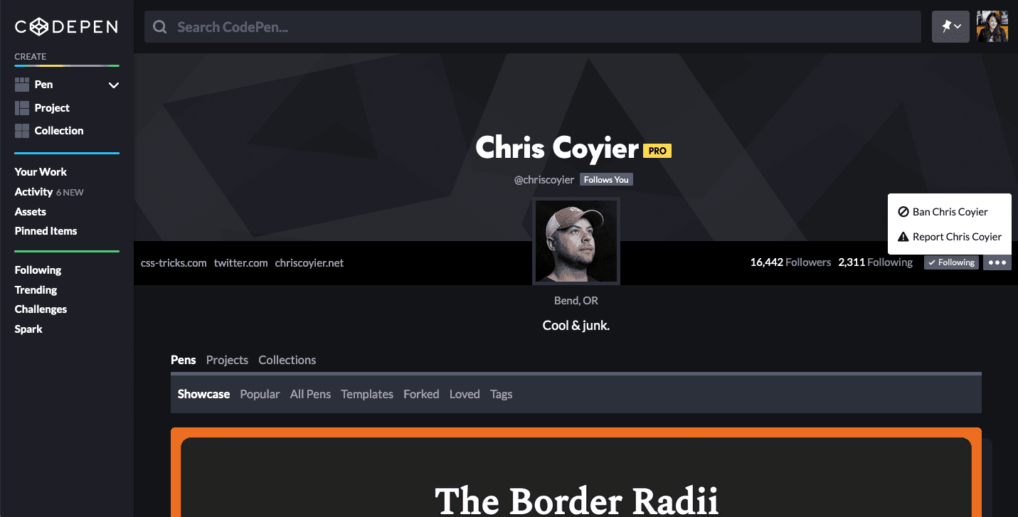
A user can ban another user from their profile or report a severe offense violating CodePen’s code of conduct.

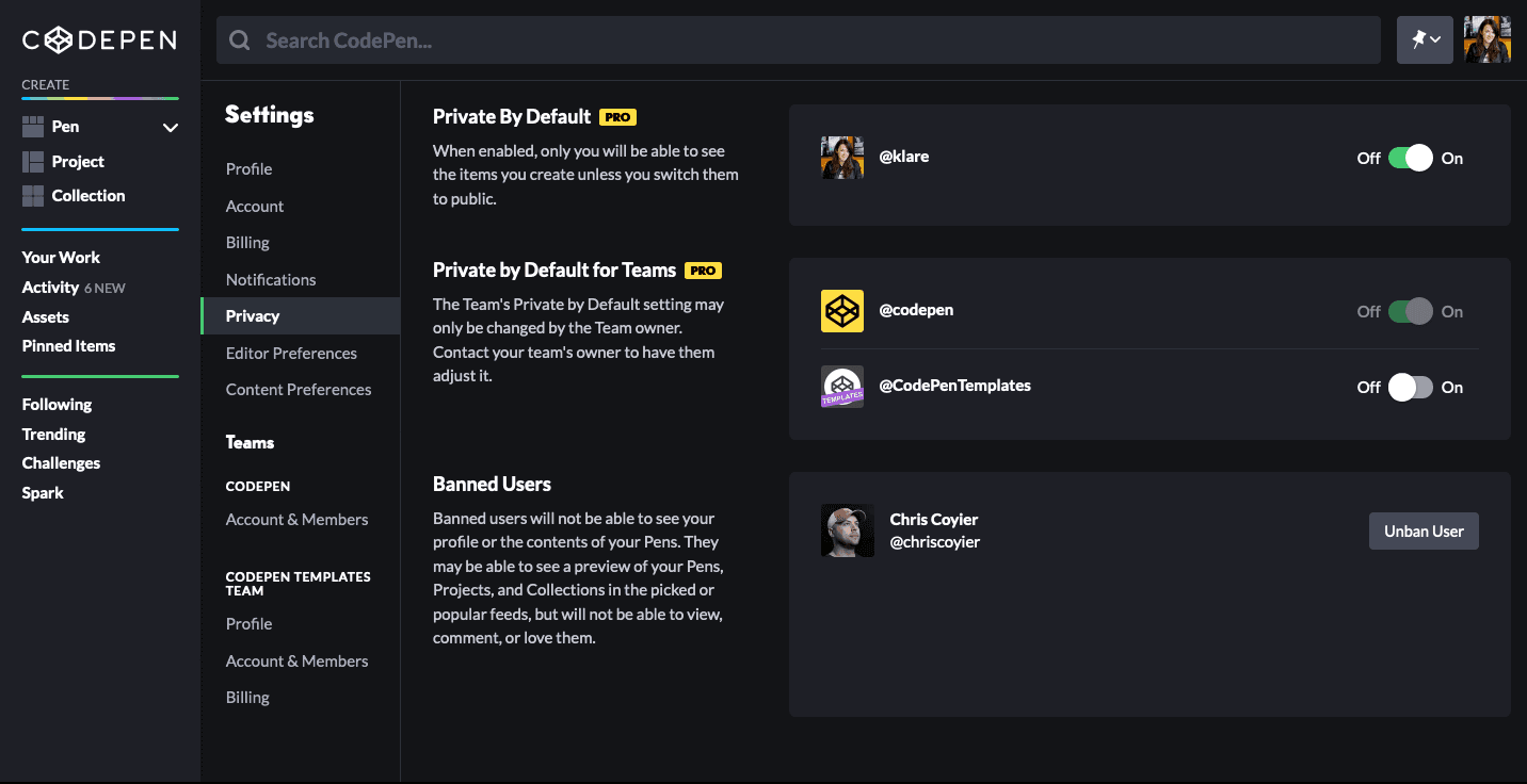
The settings privacy page was redesigned to list all banned users.
Technical challenges
Of course, any project wouldn’t be authentic without limitations. Our biggest challenge ended up being a technical limitation where it was challenging to remove blocked users from popular feeds. Unfortunately, while a blocked user would not be able to access any Pens, Projects, Collections, or profile of the person blocking, they may still be able to see a preview of work. Thankfully, personal interactions are entirely impossible, and trying to access any content would 404.
Browsing, Card Design, and Pagination
Turning goals into visual design
Reconfiguring our social feeds presented a unique opportunity to re-evaluate the effectiveness of CodePen’s browsing and visual experience, driving design decisions from data and product goals.
Team ideation
I first conducted a remote team ideation session surrounding the new social feeds to set a clear vision. Sketching or ideating with the entire team, not just designers, can help solidify a cohesive vision for the project and be more transparent about the design process with key stakeholders. I generally find that when there are significant and ambiguous projects, having a session for everyone to voice their opinions and agree upon what they think meets the stated goals can help a project move smoothly.
This session was conducted remotely, using Zoom for video conferencing and Notion to drop in sketches and take notes. To start, I reiterated our project goals and background from previous meetings. We were all given ten minutes to sketch three ideas for anything related to this project (feeds, following, how content gets displayed, navigation, etc.). After each sketch was uploaded to Notion, each person was given 5 minutes to explain their thoughts behind their ideas. Group discussion followed on how specific ideas successfully solved the project’s goals.
Card Design
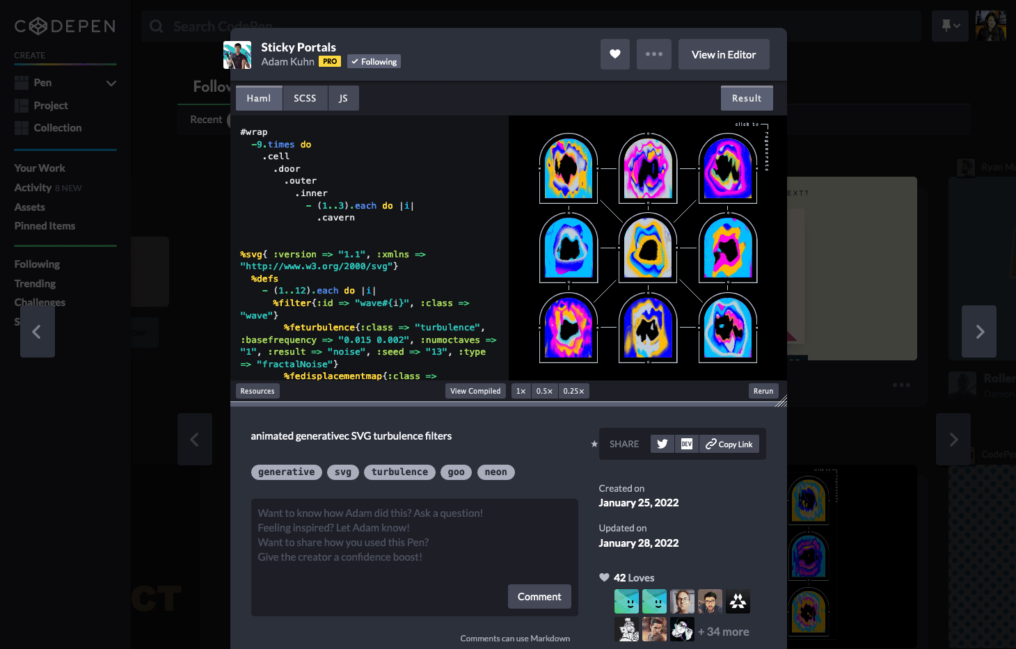
I visually updated the individual cards, this time focusing more on the screenshot or preview area, as our new feeds would now display much more compelling content. I advocated for displaying social data only on hover or focus to drive the engagement towards the content and connections rather than the numbers. Instagram affirmed this decision when it removed likes to reduce social media pressure.

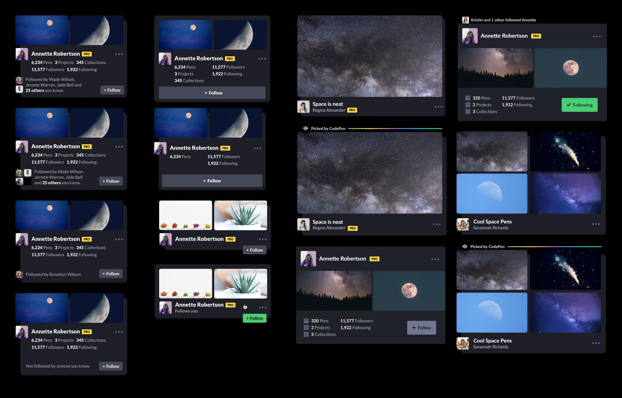
Variations on Pen, Collection, and user cards. Social interaction counts are only shown on hover for item cards, and item counts are shown on user cards for relevance.
Designing the homepage experience
I designed multiple mockups of possible feeds based on different connected strategiesto decide on the final homepage design. Designing by using connected strategies helps further tailor product and business goals to user needs and solidify a content delivery strategy.
The three connected strategies I found most applicable to our product were automated execution, curated offerings, and respond to desire. I used these three strategies to mock up three different homepages incorporating our new feed algorithms. An automated execution homepage anticipates the users’ needs by displaying recently worked on Pens and shortcuts to Pen templates based on previous work. It also displays content from other users based on the type of work coded. In the case of the below mockup, Vue patterns are shown as a feed to the user because they’ve been working on similar Pens.

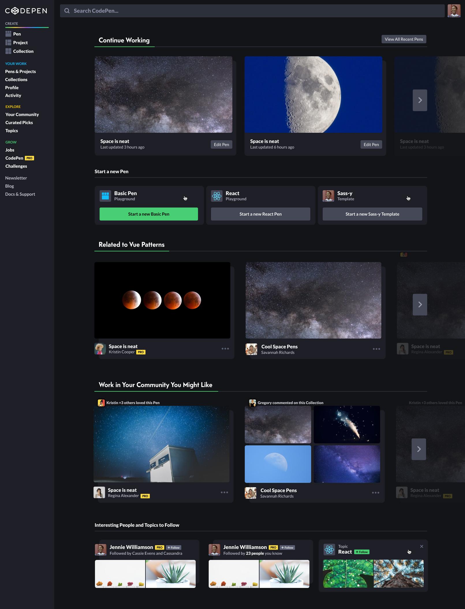
A homepage mockup designed based on the automated execution strategy.
A curated offerings approach provides several customized feeds that anticipate users’ needs and interests. These feeds don’t need to rely on a user creating work to show helpful content and can be further tailored by adopting a robust onboarding strategy. In the mockup below, several feeds are offered, including picks, following, and feeds for popular topics and challenges.

A homepage mockup designed based on the curated offerings strategy.
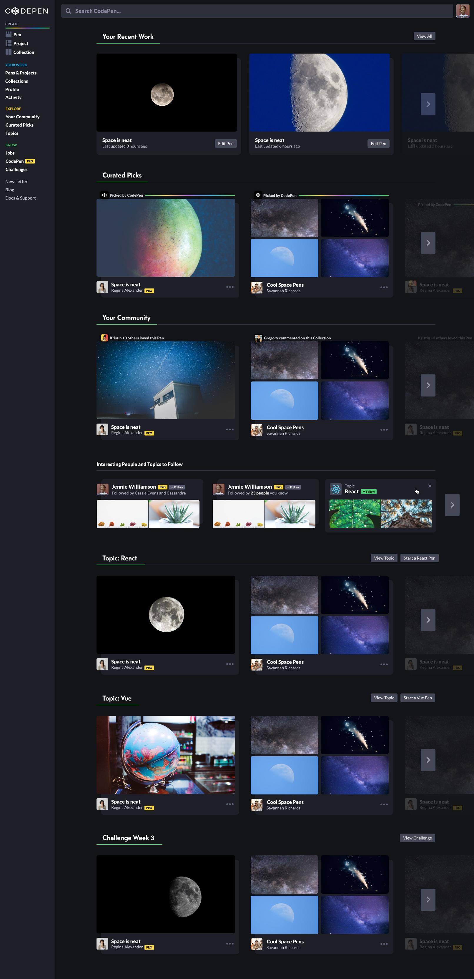
We ultimately went with a design based on the respond to desire connected strategy, which combined three views (two following feeds, the trending feed, and your work, or dashboard) into a tabbed homepage. This strategy allowed us also to solve a related problem of users not being able to quickly get back to their work by including the dashboard on the homepage instead of behind a navigation link.
Instead of stacking feeds based on type (Pens, Projects, Posts (depreciated), and Collections), the browsing experience needed to mix types of content. The popular feed incorporated better scoring for popular Pens, so they’d get the attention they deserved and fresher content as popularity would update more frequently. We kept Picked pens by combining them into the popular feed but elevated them by adding visual interest.
We also decided to keep a user’s last tab in local storage so users who prefer to browse would usually view the social feeds, while users who choose to work would mostly see the dashboard.

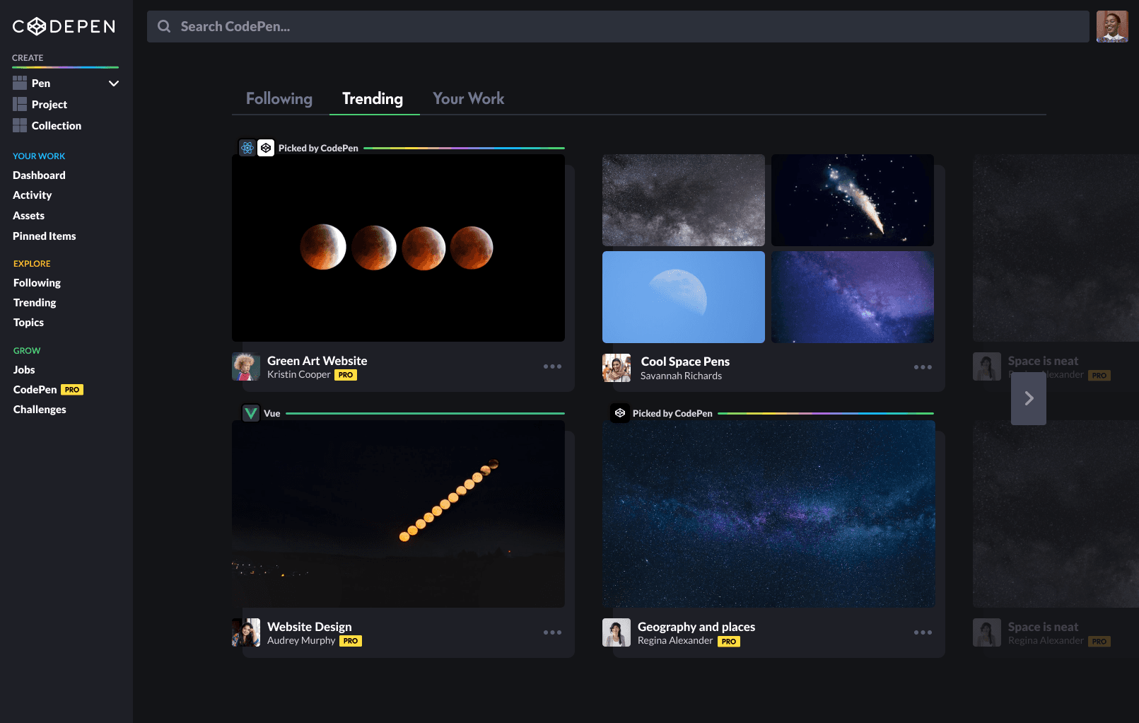
The final homepage designs combine three tabs: following, trending, and your work, based on the users’ last saved browser state.

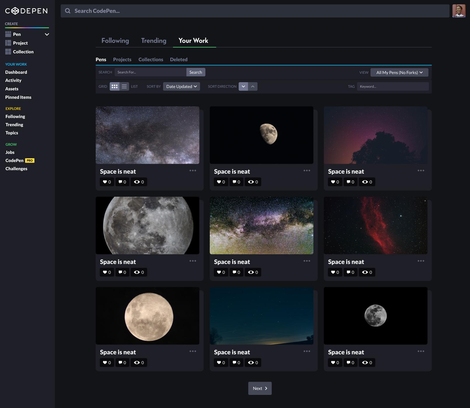
The Your Work dashboard shows item states while allowing more filtering and sorting through work a user owns.
To judge if our new feed scheme would solve user needs, I created a matrix of job stories and mapped them by sphere of influence (individual, network, community), identifying which job stories the team could reach with a redesigned experience.

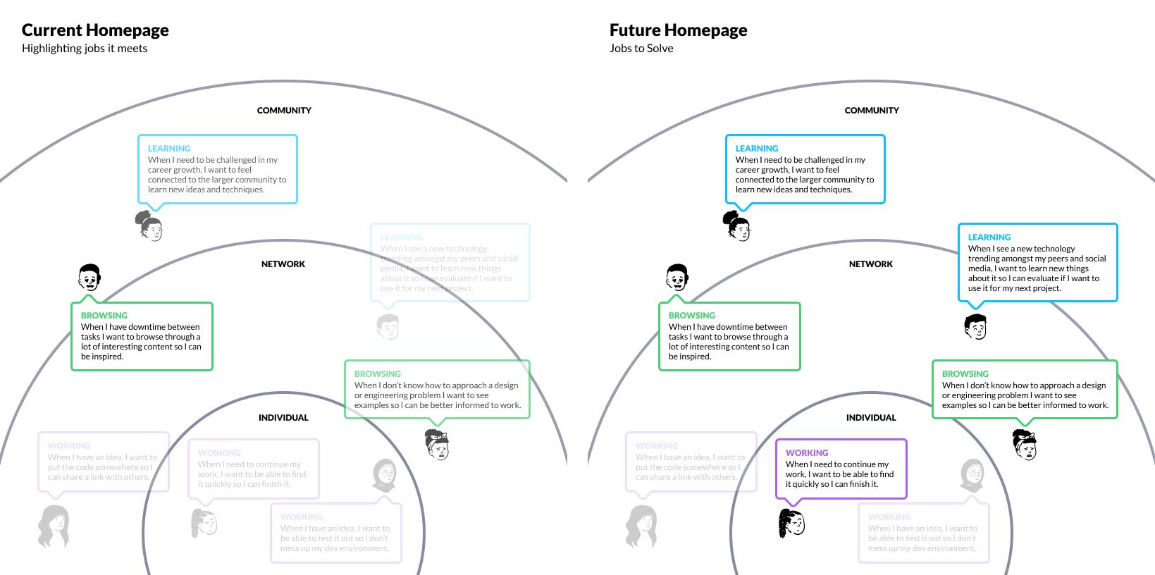
Our previous feeds, or logged-in homepage, only allowed for one of these tasks to succeed: browsing exciting content to be inspired. The new feeds would solve many more identified jobs and only miss two jobs related to working on code, which the editor would be more qualified to solve.
Grid Modal View
We also added a modal view experience to increase focused browsing. The modal lets users browse through a feed card by card, having a bigger preview area and allowing browsing of the code without opening it up in the editor. Allowing users to browse with a more focused experience solves the use case of most users browsing through engaging content without wanting to edit or fork it.

Users can focus on one Pen at a time while also seeing and manipulating code when browsing through a feed.
Technical limitations – load times
Because Pens can be very complicated, sometimes including generative code requiring considerable browser resources, we could not implement an infinite scroll experience. We instead reinvented content grids teasing previous and next content to encourage a similar interaction of scrolling without actually having to load many large Pens.
Following and recommendations
We knew that creating a feed with better ranking algorithms would improve the quality of content shown for the following feed. Still, I decided to make several design improvements to enhance connections and content delivery. The first was adding recommended users to follow. These are users who follow similar people. I decided to show these both below the main feed and as cards scattered within the feed to capture people browsing.
The second improvement was adding social connections at the top of the cards to explain why we showed content. To make the following feed more compelling and display fresher content, I decided to expose interactions someone a user is following makes, such as commenting on a Pen, loving a Project, or adding a Pen to a Collection. If multiple people a user follows love a Pen, this item gets ranked higher in the feed, and the interactions collapse.

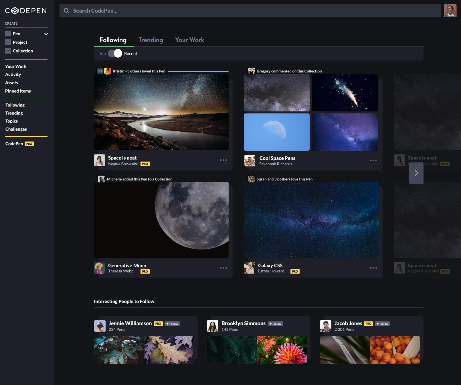
The following page lists recommended people to follow and indicates why certain items from people you don’t follow are shown at the top of the cards.
Lessons and impact
If you remember from the beginning of this case study, our initial goals were to:
Keep Picks engaging and memorable. We wanted to retain the thrill of being picked and share that success with others,
Improve the popular page to display fresh content, especially from users missed by Pen pickers, and
Improve the following feed by displaying more exciting content and suggestions of people to follow.
Even though we reduced the number of picks displayed overall by combining the picks and popular feeds, we still managed to keep the excitement of being picked.
MY PEN WAS PICKED BY CODEPEN??? 😱😱😱😱😱
I'm gonna frame this jdsfjsdhfs pic.twitter.com/39fNHl5OyR
— Nazanin Ashrafi (@nazanin_ashrafi)
Picked Pens get more love per-pen, but a Pen doesn’t have to get picked to get loved on CodePen. Heart distribution was almost evenly divided between picked and never-been-picked Pens in 2021.

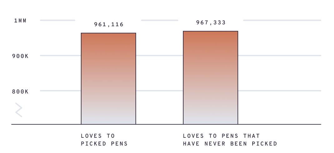
Pen loves per month by picked status
By far, the most significant impact of this project was the explosion of follows per month, starting immediately after its release and peaking at 37k+ follows in September 2021.

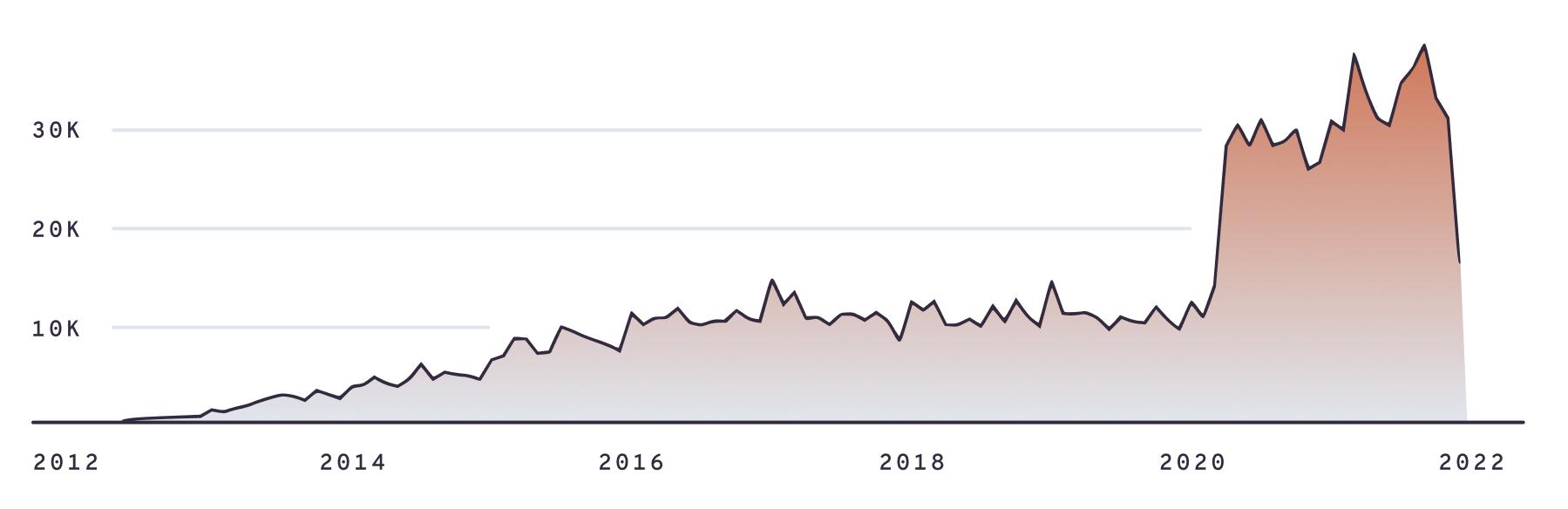
Follows Per Month
Future work
One of the problems users on CodePen face when looking for specific work, say a particular CSS pattern, is not finding relevant content. A potential follow-up project could be adding topic-based tags to Pens and providing tag searches and filters to the following and popular feeds.
For a few years, we did have topics on CodePen, but they were cumbersome to update and required manually searching and creating collections of particular topics. By automatically tagging Pens based on the type of code, our feeds could be further tailored to user needs of searching for something specific.